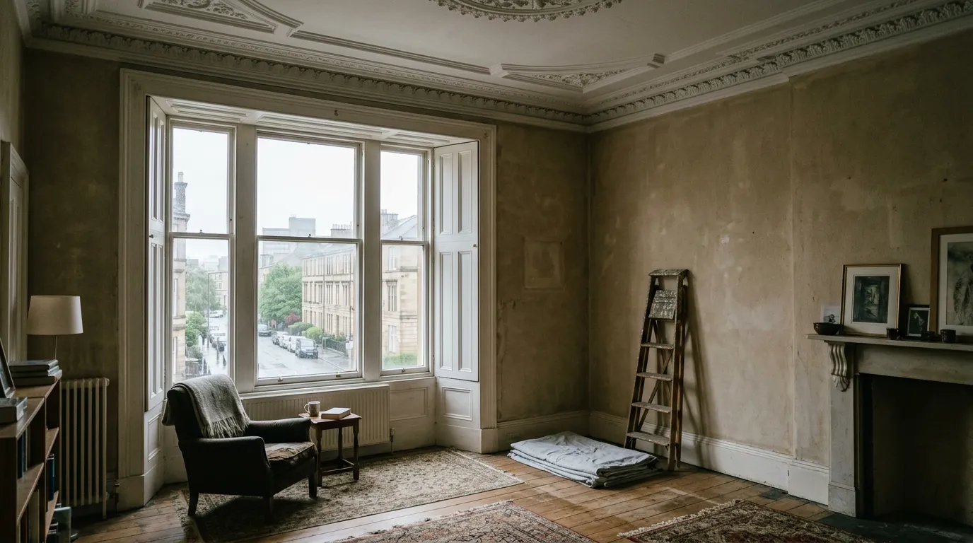
In Scotland, choose colours for dull, cool light. Glasgow gets about 1,280 hours of sunshine a year (Met Office, Paisley 1991–2020), so warm undertones suit north-facing rooms, cool blue-greys often look cold, and deep colours work well if you commit. Test A4 sample boards on two walls, morning to night, for three days.
A colour that looks warm and bright on a chart, or in a photo of a house in the south of England, can go flat and grey on a Glasgow wall in November. That isn’t bad luck. It comes from latitude, cloud and the direction your windows face, and once you understand those three things you can choose colours that hold up in every season. This guide explains the light first, then works through each room, the quirks of Glasgow flats and houses, lighting, testing and cost. Prices checked: October 2026.
Why do paint colours look different in Scotland?
Three things set Scottish light apart: the low angle of the sun, the short winter days and the amount of cloud. Each one changes how a colour reads on the wall.
The sun sits low for most of the year
Glasgow is at about 55.9° north, roughly level with Copenhagen and Moscow. Working from that latitude, the midday sun at the winter solstice climbs only about 11° above the horizon, and the day lasts about seven hours. At the summer solstice the midday sun reaches about 58° and the day runs to about 17½ hours. That swing is much bigger than most paint advice allows for, because most of it is written for places further south.
| Date (Glasgow) | Daylight, sunrise to sunset | Height of the midday sun | What it means indoors |
|---|---|---|---|
| 21 December | About 7 hours | About 11° | Weak, low light; colours look darker and cooler |
| 20 March | About 12 hours | About 34° | Fair light; a good month to test samples |
| 21 June | About 17½ hours | About 58° | Long, bright days; colours look lighter and warmer |
| 23 September | About 12 hours | About 34° | Fair light; a good month to test samples |
Figures are calculated from Glasgow’s latitude and rounded. Exact sunrise and sunset times shift by a few minutes each year.
A low sun has one benefit. When it does shine into a south-facing window in winter, it reaches much further into the room than the high summer sun does, and it can light the back wall of a deep tenement room for an hour or two around midday.
Cloud makes the light cooler and flatter
The Met Office’s long-term averages for Paisley, a long-running weather station just west of Glasgow, give about 1,280 hours of sunshine a year for 1991–2020. The UK figure for the same period is about 1,400 hours. December at Paisley averages about 34 hours of sunshine for the whole month and January about 39, against about 187 in May.
So for much of the year, the light in a Glasgow room is skylight filtered through cloud. Overcast daylight has a colour temperature of roughly 6,500–7,000 kelvin, which is cool and slightly blue compared with direct midday sun at around 5,000–5,500 K. Low evening sun drops to around 2,000 K and looks orange. You can see the effect on any wall: on a grey day, colours lose their warmth and greys drift towards blue or green.
Decorator’s tip: choose your colour for the light you live with most. In Glasgow that means a dull afternoon between October and March, not a bright June morning. If a colour still looks right then, it will look right all year.

How does the direction a room faces change a colour?
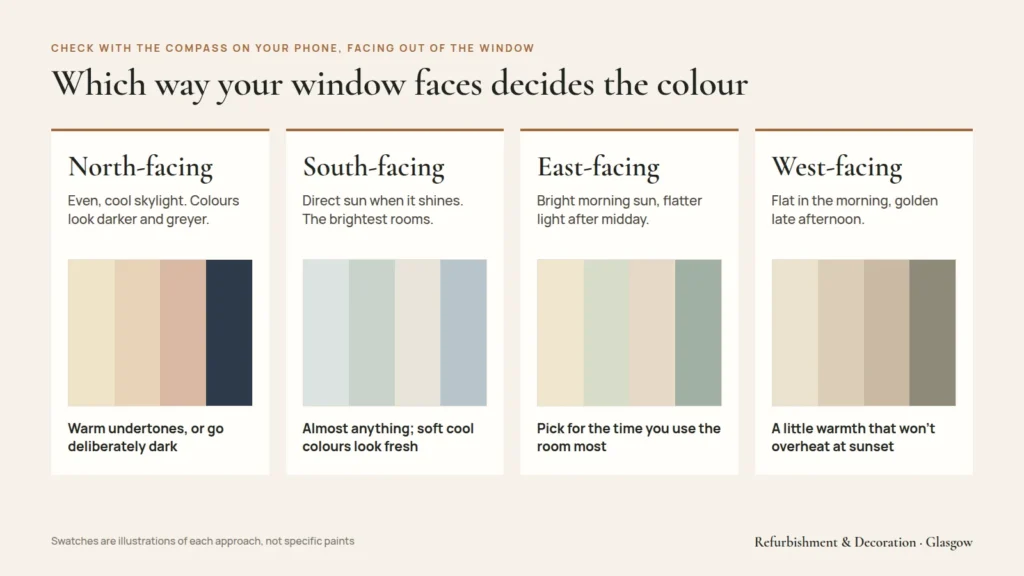
In the northern hemisphere the sun moves through the southern half of the sky, so the compass direction of your main window decides what kind of light a room gets. Check it with the compass on your phone, standing at the window and facing out.
| Window faces | Light through the day | How colours behave | What usually works |
|---|---|---|---|
| North | No direct sun for most of the year; even, cool skylight | Colours look darker, greyer and cooler; blue-grey and green-grey can turn cold | Warm undertones (yellow, red, pink), or go deliberately dark and cosy |
| South | Direct sun for much of the day when it shines; brightest rooms | Warm colours can look hotter; cool colours look fresh rather than cold | Almost anything; soft cool colours and pale neutrals are easy here |
| East | Bright, warm-ish morning sun; cooler, flatter light after midday | Colours look different morning and evening | Pick for the time you use the room most |
| West | Cool, flat morning light; warm, golden late-afternoon sun | Warm colours glow in the evening; can look dull in the morning | Colours with a little warmth that don’t overheat at sunset |
North-facing rooms do get some summer sun
At Glasgow’s latitude the summer sun rises in the north-east and sets in the north-west. So a north-facing room can catch direct sun early on a June morning or late on a June evening. That is a few weeks a year, though. For the other ten months, plan around flat skylight.
East and west rooms change character through the day
An east-facing kitchen used for breakfast suits a colour that looks fresh in morning sun. An east-facing living room used mostly in the evening will be lit by flat skylight and lamps, so it needs the same care as a north-facing room. West-facing rooms are the reverse: they glow in the evening and can look grey before lunch.
Which colours work in a north-facing room?
This is one of the most common questions we hear, and in Glasgow it matters more than most places because so many flats have a north-facing room or two. There are two approaches that work and one that usually doesn’t.
Approach one: warm, light colours
If you want a north-facing room to feel lighter, choose pale colours with a warm base: creams, soft yellows, warm whites, plaster pinks and stone colours with a red or yellow undertone. They counteract the blue cast of the skylight. Farrow & Ball’s own advice on light is that northern light “tends to bring out the cooler tones within a colour”, so for lighter tones you should avoid anything with a blue or grey base. It suggests yellow-based whites such as Yellow Ground, New White and White Tie. Other brands have their own equivalents; what matters is the undertone, not the name on the tin.
Approach two: go dark on purpose
The other option is to stop fighting the light. A deep colour in a north-facing room never looks washed out, because there is no strong sun to bleach it. Inky blues, deep greens, aubergine and near-black can make a small north-facing study or bedroom feel enclosed and warm, especially in the evening under lamps. Farrow & Ball names Railings and Down Pipe as examples. Dark walls work best when you commit to them, often taking the colour over the woodwork too, rather than using a mid-tone that ends up muddy.
What usually goes wrong: cool greys and “safe” whites
The colour that disappoints most often in a north-facing Glasgow room is a light grey with a blue or green base. On the chart it looks calm and modern. On the wall, under cloud, it reads as cold and slightly dingy. Brilliant white has a similar problem: in north light it tends to look blue-grey rather than crisp, because there is no warm sunlight on it. A white with a little yellow or red in it usually looks whiter in practice.
A worked example: a north-facing tenement bedroom
A typical case: a back bedroom in a West End tenement, 3.6 m by 3.2 m with a 3.1 m ceiling, one sash window facing north onto the back court. The owner likes grey.
- A cool mid-grey sample looks cold and flat on a December afternoon, and green-tinged under the ceiling light.
- A warm grey, closer to a grey-beige with a red undertone, holds its warmth in the same light.
- The ceiling goes in a soft warm white rather than brilliant white, so the high ceiling doesn’t look grey by comparison.
- Woodwork goes in the same warm white, or a shade or two darker than the walls if the owner wants the sash and skirting to stand out.
The result is still grey, which is what the owner wanted, but it is a grey that suits the light.
How do undertones, LRV and sheen affect a colour?
Three technical terms on paint charts are worth understanding, because they explain most of the surprises people get when the paint goes on.
Undertone
Almost every colour has a second colour inside it. A grey may lean blue, green, purple or brown. A white may lean yellow, pink, grey or blue. In strong sun you barely notice; in flat Scottish light the undertone comes forward. The simplest way to see it is to hold the sample against a sheet of plain white printer paper. The undertone shows up straight away.
Light reflectance value (LRV)
LRV is a scale from 0 (absorbs all light) to 100 (reflects all light), printed on many colour cards and brand websites. In practice the brightest whites sit around 85–94 and the deepest blacks around 3–6.
| LRV | What it looks like | Where it suits a Glasgow home |
|---|---|---|
| 80 and above | Whites and the palest tints | Ceilings, dark halls, rooms where you need every bit of bounce |
| 60–80 | Light neutrals and pastels | Most living rooms and bedrooms; bright north-facing rooms |
| 40–60 | Mid-tones | South and west rooms; feature walls; can look muddy in dim north rooms |
| Below 40 | Deep colours | Deliberately dark rooms, woodwork, small studies, dining rooms used at night |
LRV also matters for safety. BS 8300, the British Standard on accessible building design, generally looks for a difference of about 30 points in LRV between surfaces that need to stand out from each other, such as a door against its wall or a handrail against a stair wall. If someone in your home has poor sight, keep that gap in mind when choosing colours for a hall, stair or landing.
Sheen
The flatter the finish, the more it absorbs light and the softer and deeper a colour looks. A flat matt hides the waves and patches of old plaster well, which is why it is popular in tenements. A higher sheen reflects more light but shows every bump. For example, Farrow & Ball’s Estate Emulsion is listed at 2% sheen, its Modern Emulsion at 7% and its Modern Eggshell at 40%. The same colour will look slightly lighter and cooler in a higher sheen. So if you test a sample in one finish, buy the same finish for the walls.

What makes Glasgow homes different?
Glasgow’s housing stock brings its own colour problems. These are the ones we see most often.
Tall ceilings and deep rooms in tenements
Victorian and Edwardian tenement rooms often have ceilings of 3–3.6 m and deep plans, with the window on one wall only. Light falls off quickly towards the back of the room. That has three consequences:
- The wall opposite the window will always look noticeably darker than the window wall. Test samples on both.
- A large, tall ceiling in brilliant white can look grey in contrast with warm walls. A soft white, or the wall colour mixed at a quarter strength, often looks cleaner.
- If you want the room to feel lower and cosier, take the wall colour above the picture rail and onto the ceiling. If you want height, keep the frieze and ceiling pale.
For more on high ceilings, cornices and older plaster, see our guide to painting a Glasgow tenement flat and the article on painting cornicing and ceiling roses.
Back courts and facing buildings
Rear rooms in a tenement usually look across a back court to another block. That block cuts out sky and casts the room into shade for much of the day, even if it faces south. Treat these rooms as north-facing, whatever the compass says.
The buildings around you also colour the light. Sunlight bouncing off a red sandstone facade across the street can add a warm, pinkish cast to a room, while blond sandstone or a white rendered block opposite gives a cleaner, brighter reflection. Big trees in a West End or Southside street turn summer light green. None of this shows on a colour chart, which is another reason to test on your own walls.
Sash windows and deep reveals
Thick stone walls mean deep window reveals and shutter boxes. The reveal and shutters catch light straight from the sky, so a colour there looks brighter than the same colour on the walls. Many people paint shutters and reveals in a white or pale colour to throw light into the room, and use a stronger colour on the walls.
Closes, halls and internal rooms
A tenement hall often has no window at all, and newer flats often have internal bathrooms. Here the only light is artificial, so you are choosing a colour for your bulbs, not for daylight. Warm whites and pale warm neutrals are easy; strong colours can work well in a hall precisely because there is no daylight to change them through the day.
Modern flats and semis
Newer flats along the Clyde and post-war semis have lower ceilings, around 2.4 m, and bigger windows relative to the room. They get more light per square metre than a tenement, so mid-tones work more easily. Large picture windows facing north still bring in a lot of cool light, though, so the undertone advice applies in full.
Outside: doors, windows and render
Exterior colours face the same grey light, plus rain and wind. Very pale colours on a harled house show dirt and algae streaks quickly in the west of Scotland, while mid-tone stone and putty shades stay looking clean for longer. Before you change the colour of windows, a front door or the outside walls, check whether your home is in a conservation area or listed. In those cases Glasgow City Council may need to approve a colour change, and unpainted sandstone should generally stay unpainted. Check the current position with the council’s planning team before acting. Our exterior painting page has more on this.

Which colours suit each room?
Every room has its own light, use and wear. This table is a starting point, not a rule.
| Room | Typical light in a Glasgow home | Colour approach | Finish to consider |
|---|---|---|---|
| Living room | Often a bay window to the street; used mainly in the evening | Test under lamps as well as daylight; warm mid-tones or a deep colour if used mostly at night | Flat or standard matt |
| Bedroom | Front or back; used morning and night | Soft, calm colours; dark colours work well in small back bedrooms | Matt |
| Kitchen | Often at the back, facing the court | Warm whites and light colours with yellow or red undertones | Washable, scrubbable matt or eggshell |
| Bathroom | Small window or none | Choose under the actual bulbs; warm whites flatter skin | Moisture and mould-resistant paint |
| Hall and stair | Little or no daylight | Light warm colours, or a strong colour that looks good under lamps; mind LRV contrast | Durable, scrubbable matt |
| Box room or study | Small window, often north or onto the court | Commit: very light and warm, or properly dark | Matt |
Kitchens and bathrooms: the finish matters as much as the colour
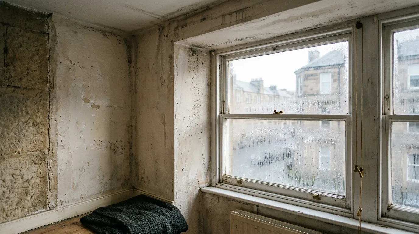
Steam and cooking moisture are a big issue in Glasgow homes, especially in flats with single-glazed sashes and cold external walls. The right paint for these rooms is a washable or mould-resistant finish, and choosing it comes before choosing the colour. Our guide to damp, condensation and mould explains which paints and wallpapers to use and what to fix first.
Woodwork and ceilings
White woodwork against coloured walls is the classic look in Scottish flats and suits most rooms. In a north-facing room, a white with a touch of warmth looks cleaner than brilliant white. In a dark room, painting the skirting, doors and facings the same colour as the walls (or a shade darker) makes the room feel calmer and larger, because the eye isn’t stopped by white lines.
Feature walls
A feature wall is a cheap way to try a strong colour. The best wall is usually the one you see as you walk in, or the wall behind a bed or sofa. Avoid the window wall in a north-facing room: it is always in shadow, so a strong colour there will just look dark. If you are thinking of paper rather than paint, see our guide to feature wall wallpaper, or look at our wallpaper hanging service.

How do light bulbs change paint colours?
In a Glasgow winter you may see your walls more by lamplight than by daylight, so bulbs deserve as much thought as paint.
Colour temperature
LED bulbs are sold by colour temperature in kelvin. Around 2,700 K is “warm white”, similar to old filament bulbs. Around 3,000 K is a slightly crisper warm white. Around 4,000 K is “cool white” and 5,000–6,500 K is “daylight”. Warm bulbs push colours towards yellow and make blues and greys look greener or duller. Cool bulbs make warm colours look flatter and can make a cream look grey.
Colour rendering
The colour rendering index (CRI) tells you how faithfully a bulb shows colours, on a scale up to 100. A bulb with a CRI of 90 or above shows paint colours much more accurately than a cheap one in the low 80s. If you have just paid for a deep colour, cheap bulbs can make it look muddy.
Practical rules
- Use the same colour temperature of bulb throughout a room. Mixing warm and cool bulbs makes walls look patchy.
- Test samples with the bulbs you will actually use, at night with the curtains closed.
- If you change your bulbs after painting, expect the colour to change too.
Decorator’s tip: photograph your sample boards on your phone at the same time each day, with the camera’s colour setting locked if it allows. Phone cameras correct colour automatically, so they are not perfect, but a set of photos side by side helps you remember how each sample looked in different light.
How should you test paint samples?
Testing properly is the single biggest thing you can do to avoid an expensive mistake. Sample pots cost a few pounds each; Farrow & Ball’s 100 ml pots are about £6 at the time of writing. That is far less than repainting a room.
A step-by-step method
- Shortlist no more than three or four colours. More than that and they start to look alike.
- Paint sample boards, not the wall. Use A4 card or lining paper, give each two coats, and leave a 2–3 cm white border. Painting straight onto the old colour distorts what you see, because the eye compares the sample with the colour around it.
- Put each board on at least two walls: the one opposite the window and the darkest corner. Low down and high up if the ceiling is tall.
- Look at them at four times: mid-morning, early afternoon, dusk and at night under your own lamps.
- Look on a dull day as well as a bright one. In Glasgow you rarely have to wait long.
- Live with them for at least three days before deciding.
- Check them against fixed things: the floor, a sofa, kitchen units, tiles, a fireplace. A colour has to work with those, not just on its own.
Remember the size effect
Colours almost always look stronger on a whole wall than on a small sample, because the light bounces between walls of the same colour and intensifies it. If you are torn between two shades, the slightly softer one is usually the safer choice. A full wall of a bright yellow, for example, looks much more yellow than the card suggested.

Mistakes to avoid
- Choosing from a screen. Screens show colours lit from behind and calibrated differently; never order a full tin from a photo.
- Testing in summer for a room you’ll use in winter. June light makes almost everything look good.
- Using a cool grey in a north-facing room because it looked calm in a magazine photographed somewhere sunnier.
- Testing one finish and buying another. A 2% sheen and a 7% sheen version of the same colour look different.
- Switching brands to save money with a colour-match without testing the match first. A matched colour in a different base and finish can look noticeably different. Our comparison of Farrow & Ball and Dulux Trade explains when that works and when it doesn’t.
- Forgetting the ceiling. A brilliant white ceiling over warm walls can look grey or blue.
- Ignoring what’s next door. Rooms open to the hall are seen together; colours that look fine alone can clash through an open door.
What does a colour change cost?
Choosing a new colour doesn’t change the price much on its own. What changes it is how big a jump you are making, because a strong change can need an extra coat or a tinted primer, and that adds time.
Market prices for repainting
These are published market ranges, with the source and date named. They include labour and materials unless stated, and they are not R&D’s prices.
| Job | Market range | Typical time | Source |
|---|---|---|---|
| Box room repaint | £175–£300 | 4–6 hours | MyJobQuote (Sep 2026) |
| Small bedroom repaint | £250–£400 | About 1 day | MyJobQuote (Sep 2026) |
| Large bedroom repaint | £350–£660 | 1–1.5 days | MyJobQuote (Sep 2026) |
| Living room | £300–£530 small / £500–£990 large | Up to 2 days | MyJobQuote (Sep 2026) |
| Average room, Glasgow, materials included | £350–£600 | 1–2 days | BestBuilders Glasgow (Aug 2026) |
| Hall, stairs and landing | £875–£1,350+ | 1.5–2 days | MyJobQuote (Sep 2026) |
| Feature wall | £120–£250 | Part of a day | MyJobQuote £120–£180 (Oct 2026); BestBuilders £140–£250 (Aug 2026) |
| Decorator day rate, Glasgow / Scotland | £150–£290 a day | n/a | BestBuilders Glasgow (Aug 2026); Trade2Base (Jun 2026) |
For the full picture, including whole-house figures, see our guide to painting and decorating prices in Glasgow.

What pushes the price up when you change colour
- Dark to light. Covering a deep red or navy with a pale colour often needs a primer or undercoat plus two coats. Expect part of an extra day on a large room.
- Light to very dark. Deep colours can need three coats to look even, especially on patched old plaster.
- Premium paint. Designer brands cost more per litre and some cover fewer square metres per litre. On a single bedroom the difference is usually tens of pounds, not hundreds.
- High ceilings. A 3.3 m tenement room has far more wall than a 2.4 m modern room of the same floor size, and may need a tower or platform.
- Woodwork. Changing the woodwork colour means sanding, priming and two coats on every skirting, door, facing and window.
Getting a price for your home
If you would like help choosing colours for your rooms, we are happy to look at samples with you during a visit and talk through what will work in your light. We give a guide price on the phone, then a fixed written quote after a free visit, so you know exactly what is included before any work starts.
Call us on 07777 780557, or book a free visit. You can read more about our interior painting service and the areas we cover across Glasgow and Central Scotland.
Questions people ask
What colour should I paint a north-facing room in Scotland?
Pick pale colours with a warm base, such as creams, warm whites, soft yellows and stone shades with a red or yellow undertone. They offset the cool, bluish skylight a north-facing room gets for most of the year. Or go deliberately dark: a deep blue, green or near-black never looks washed out because no strong sun bleaches it. Light greys with a blue or green base usually look cold.
Why does my paint look different on the wall than on the chart?
Three things change it: the light, the size of the area and the colours around it. Glasgow's light is often cool and overcast, which brings out blue and green undertones. A whole wall reflects colour onto itself, so it looks stronger than a small chip. Painting a sample straight onto the old colour also distorts it, which is why we use sample boards with a white border.
Is Farrow & Ball worth it compared with Dulux Trade?
For low-wear rooms where you want a soft, chalky finish and colour depth, many people think Farrow & Ball Estate Emulsion is worth it. For halls, kitchens, children's rooms and rentals, Dulux Trade Diamond Matt is tougher and cheaper. On the walls of a large bedroom, the designer paint typically adds about £100 in materials at October 2026 retail prices.
How much does it cost to paint a room in Glasgow?
BestBuilders Glasgow (Aug 2026) puts an average room at £350–£600 including materials. MyJobQuote (Sep 2026) gives £250–£400 for a small bedroom and £350–£660 for a large one. A big colour change, such as dark to light, can add a primer coat and part of an extra day. We give a guide price on the phone and a fixed quote after a free visit.
Does a dark colour cost more to paint?
It can. Deep colours often need three coats to look even, especially on patched old plaster, and going from dark back to light usually needs a primer or undercoat first. Each extra coat is labour as well as paint. Against a Glasgow day rate of £150–£290 (BestBuilders Glasgow, Aug 2026; Trade2Base, Jun 2026), an extra coat on a large room can add part of a day.
What paint should I use in a kitchen or bathroom that gets condensation?
Use a washable, scrubbable finish, and an anti-mould paint where mould has appeared before. Glasgow City Council's damp guide says anti-mould paints must not be painted over once applied, so they go on as the top coat. Fix the ventilation first: an extractor fan and steady heating do more than any paint. Colour comes after the finish in these rooms.
Can you paint interior walls in winter in Scotland?
Yes, as long as the room is heated and ventilated. Many paints should not be applied below 10 °C; Farrow & Ball says this for Estate Emulsion. Winter is also when Scottish light is weakest, which makes it a good time to test colours: if a shade looks right on a dull December afternoon, it will look right all year.
Is it cheaper to paint than to wallpaper a feature wall?
Usually, yes. Painting a feature wall is part of a normal repaint and needs only a sample pot's worth of extra colour. Hanging paper on one wall costs £120–£250 in labour on published ranges (MyJobQuote £120–£180, Oct 2026; BestBuilders £140–£250, Aug 2026), plus the paper itself. Paper gives pattern and texture paint can't, so it depends on the look you want.

Painters and decorators working across Glasgow & Central Scotland, specialising in interior painting and wallpaper hanging. Prices in our guides are reviewed every year.
 Farrow & Ball vs Dulux Trade for a Glasgow Home
 Damp, Condensation & Mould: the Right Paint and Wallpaper for Glasgow Homes